-
Type:
Improvement
-
Resolution: Fixed
-
Affects Version/s: None
-
Component/s: Editor general, usability editor
-
Medium
-
UI improvements in the QA overview of an opened segment in the editor.
-
Emptyshow more show less
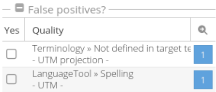
We got the suggestion to make make the actual word, that is the error bold in here (right side column in the editor) and maybe the whole part larger.
Also lines should break, if they are longer then the width of the Quality column (see screen).
Also remove the dashes around the actual error and put the >> char between the error type and the error, that you already use between the main category and the error type.